I’ve been meaning to pop in and visit The Cartoon Museum which has just been re-launched at 63 Wells Street in London. Then just this week I was looking thorough some of the shortlisted candidates in the Dezeen Awards for outstanding architecture, interiors and architecture when I came across the nominated design work for the museum led by Sam Jacob Studio. Quite brilliantly they have used the exaggerated language of cartoons and comics as inspiration for the new environment.
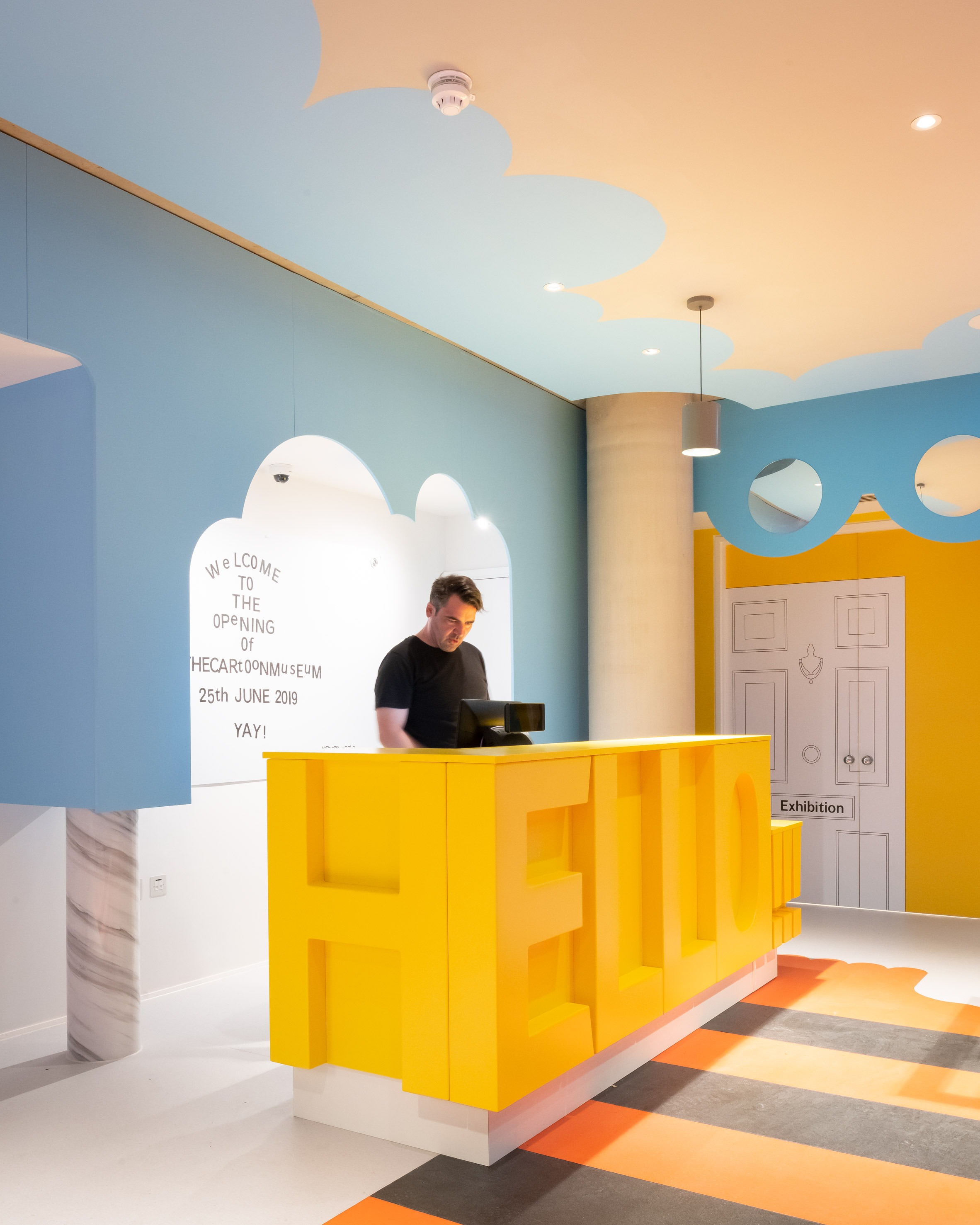
I’ll just show you a few examples of their work, taken from the fine article by Tom Ravenscroft, which I really like. First up the reception desk. Just look at this image above
They’ve turned a humdrum piece of furniture with its simple form and function and elevated it into something approaching an art installation. It shouts Hello! boldly and confidently and instantly welcomes visitors in. And with the use of its bold primary colour it just anchors the ‘hi there can I help’ function in the space. You can just imagine visitors snapping selfies from the desk – it’s a perfect bit of design for the Instagram generation.
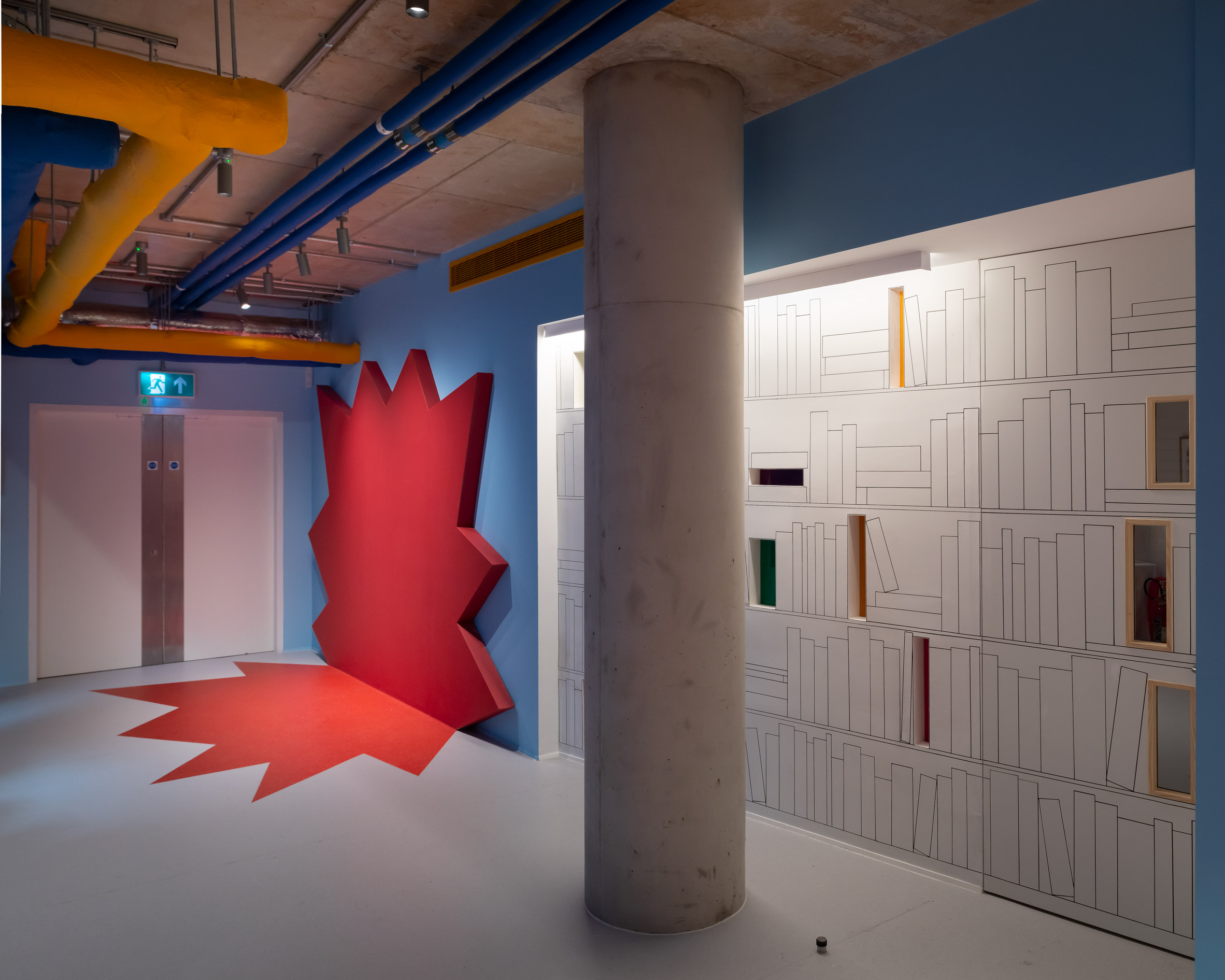
Next up a pair of sliding doors transformed by some simple artwork, almost a trompe l'oeil effect, into a library wall. It is decorative and functional and the coloured light openings/book ends remind you of its playful setting …

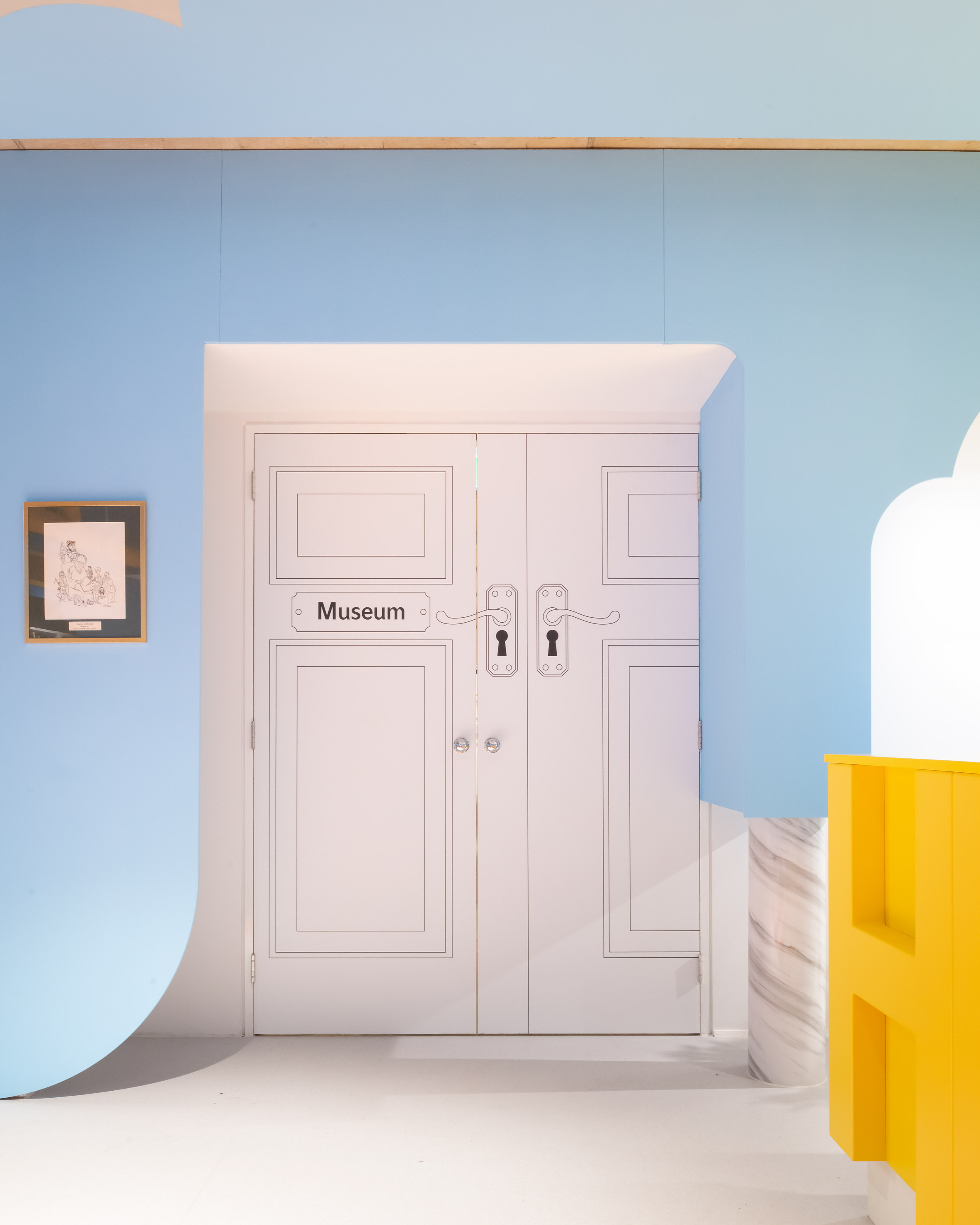
Finally a set of doors that are completely plain and flat white are transformed with a bit of design whimsy into an exaggerated line-drawn panelled effect which draws the visitor through to the inner space. It’s simple and charming and so effective…

There you go, some clever use of design to make a space stand out, make you smile and perform its function perfectly. It’s what we space designers always endeavor to do – create impact and form in harmony.
Photography is by Jim Stephenson.
