This is the second in an occasional series on design things I really really like. Things that strike you as just beautifully designed like an Eames lounge chair or the Guggenheim Museum in NYC. When form and function are in perfect harmony. Every once in a while you see something that makes you stop and think that is that is so fitting, it's hard to see how it can be improved upon.
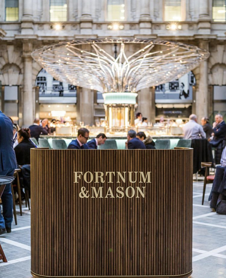
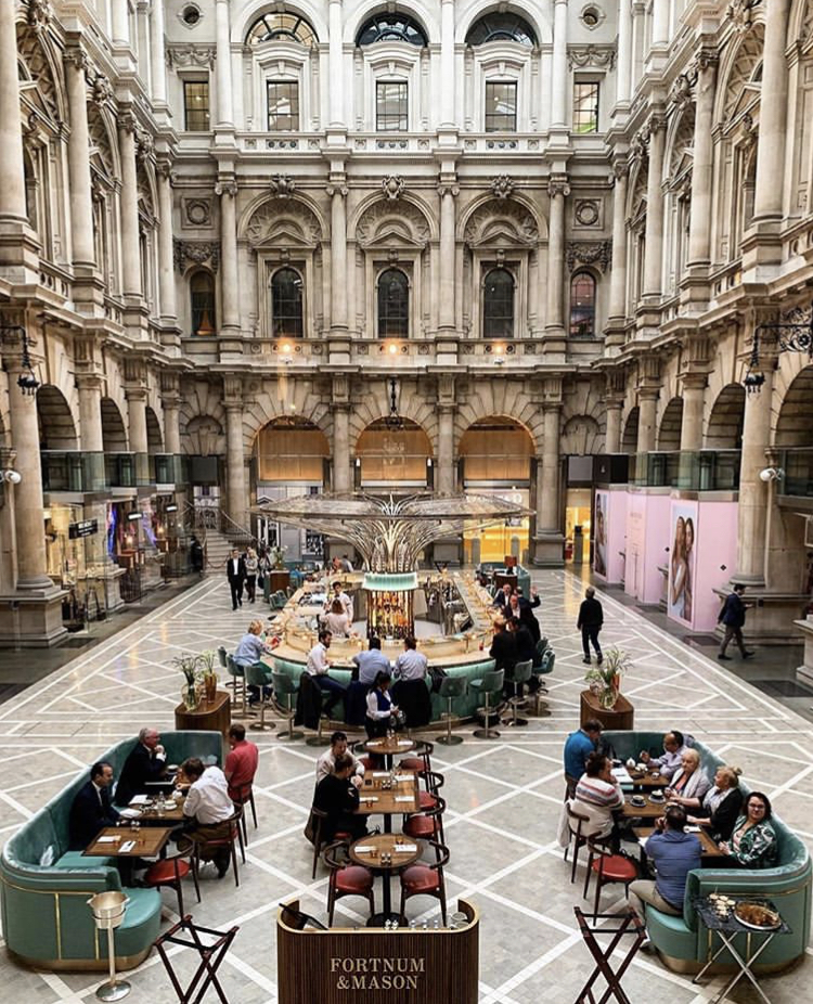
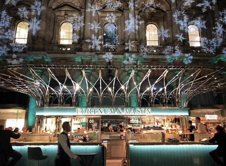
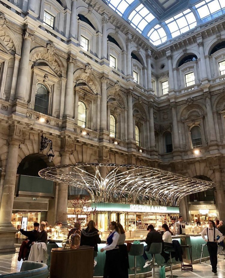
And that’s exactly what I thought when I came across Fortnum & Mason's newish bar in the Royal Exchange in London. Look at it, it is just so elegant. The interior of the Royal Exchange building is a big yawning space to occupy but the curvaceous form of the new bar looks stunning and it literally steals the limelight from the classical background. It looks like a beautiful and elegant woman stood in the concourse of the Grand Central Station. And you can’t take your eyes off her. That trademark pale green Eau de Nil is utter F&M. Branding at its most subtle and excellent.

Design Flexibility
We keep banging on about the importance of creating memorable workspace imagery and it comes as no surprise to find this bar/restaurant voted London's most instagrammable new location. It creates its own publicity.

Ahh great workspace design - this is an inspiration to us at Blue Fig Interiors. And I’d be very very happy to share a glass of champagne seated at the bar with the first business owner who commissions a fit-out from BFI in 2020. Chin chin!

Peter, MD, Blue Fig Interiors
